LO-FI
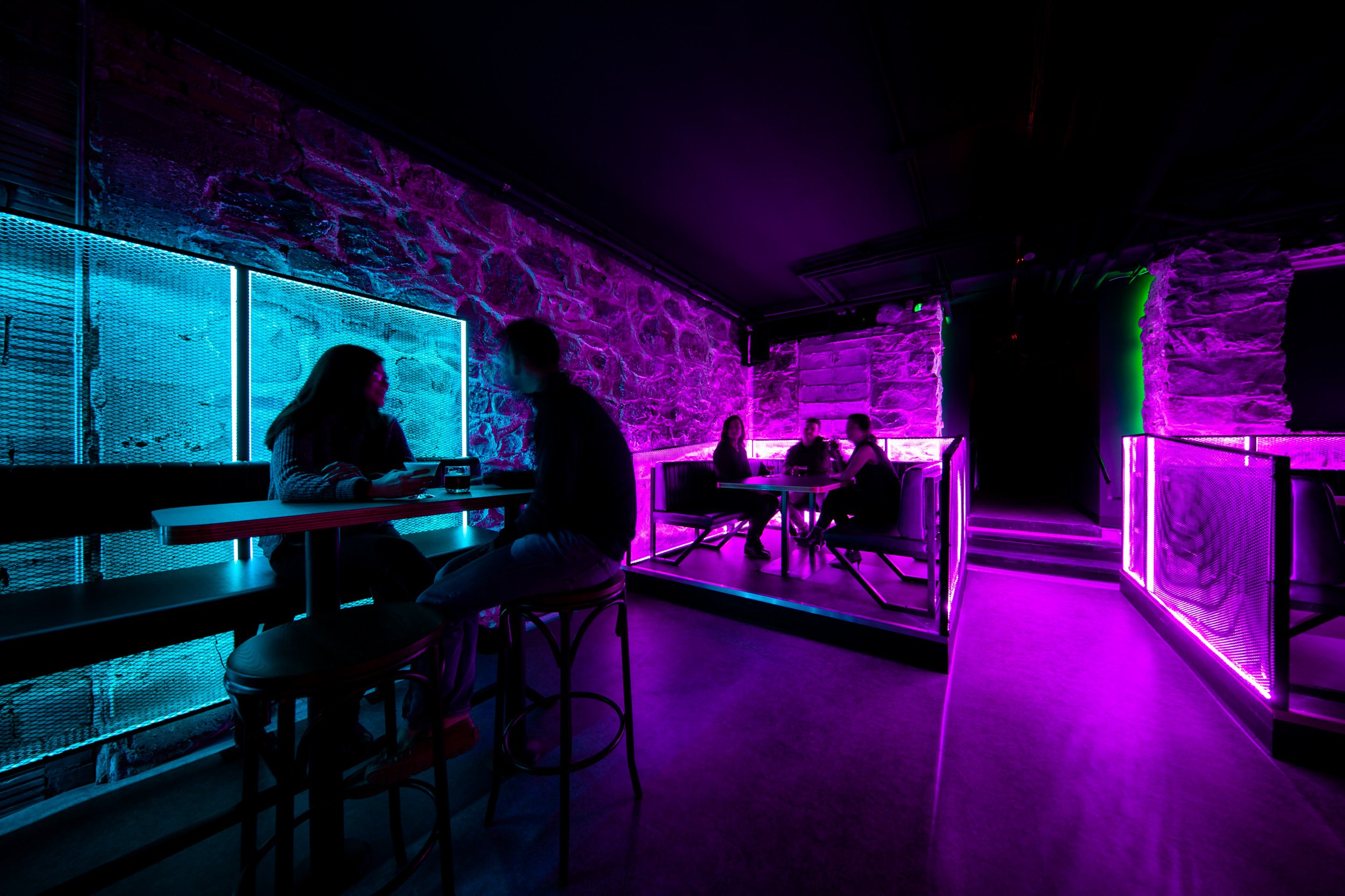
This revived interior space, a cyberpunk bar and music venue, is known as Lo-Fi.
Renovated in 2018, this bar’s gritty shell is punctuated with custom perforated metal furniture, streaks of LED lighting, an international street artist mural, and neon dragon overlooking the entire scene.
A walk down a warp-speed staircase on Main Street in Ann Arbor’s historic district and you’ll feel like you are discovering an abandoned speakeasy: a futuristic drinking hole built out by a crew of blade runners who crashed and used scraps from their broken down spacecraft.
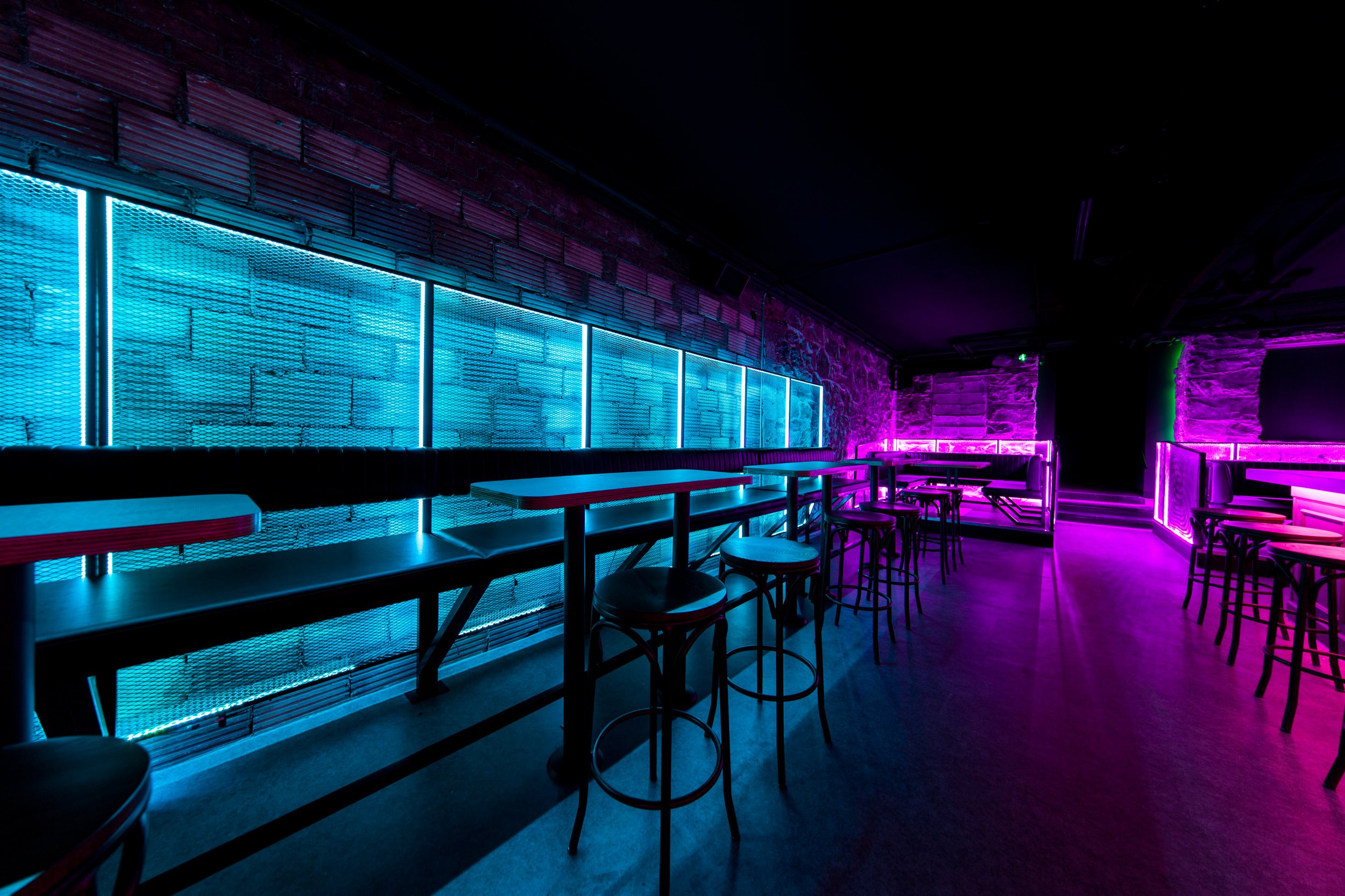
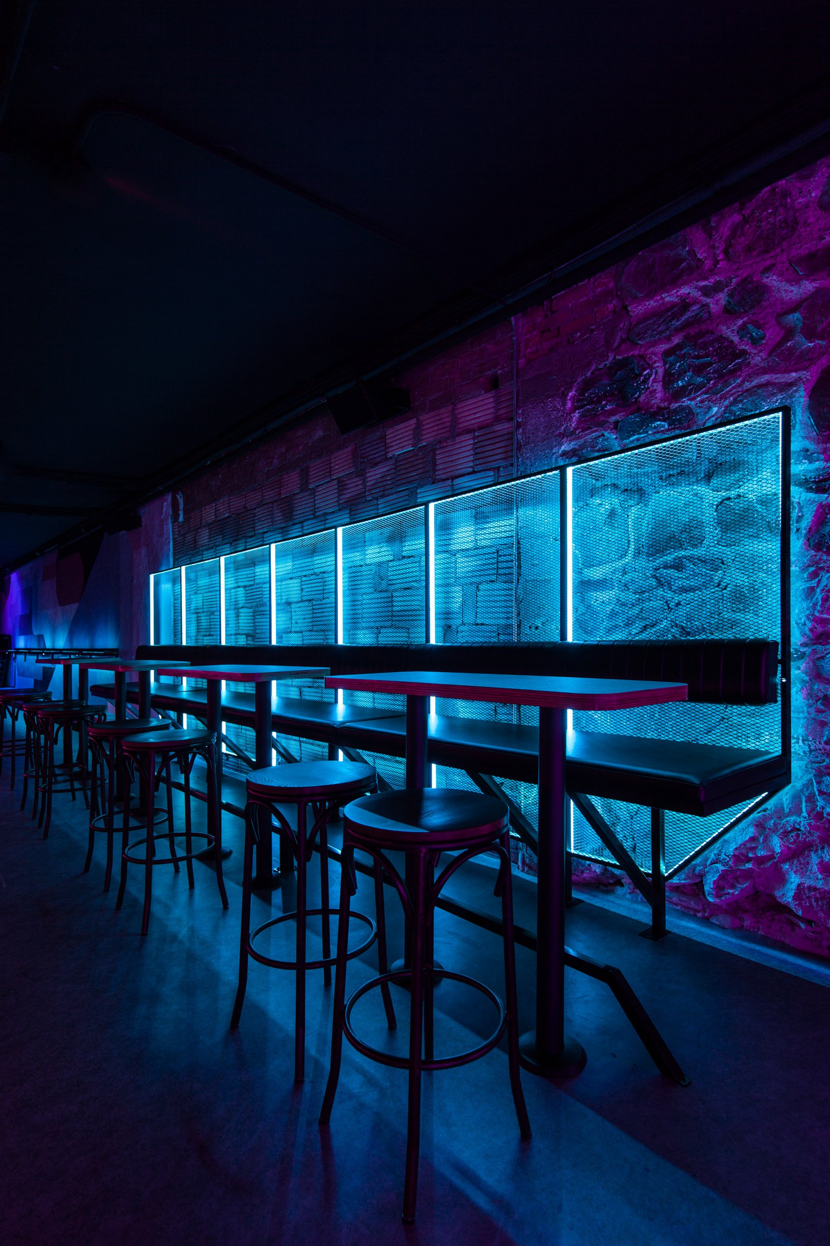
Using the raw material palette of this historic building — fieldstone foundation, brick wall infills, and fire block tile — the space has a textured and haphazard feel brought together through delineated space organized by light and fixtures.
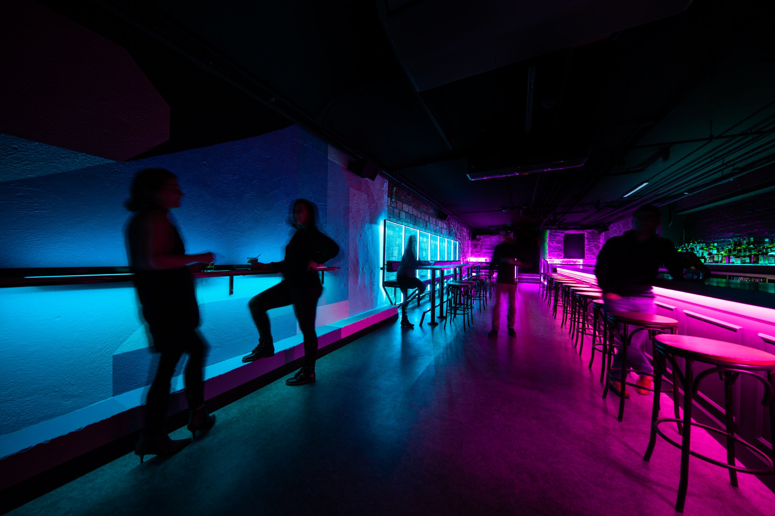
Lighting as a material is attuned to the experience of the space through ambient zones as they react to the existing materials and constructed interiors.
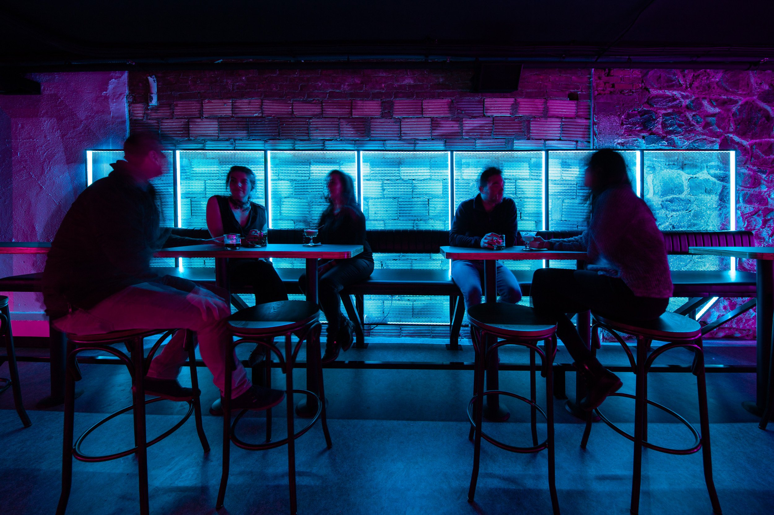
The architects went beyond design to also custom fabricate all of the tables and bench seating in the space including integrated linear lighting fixtures.
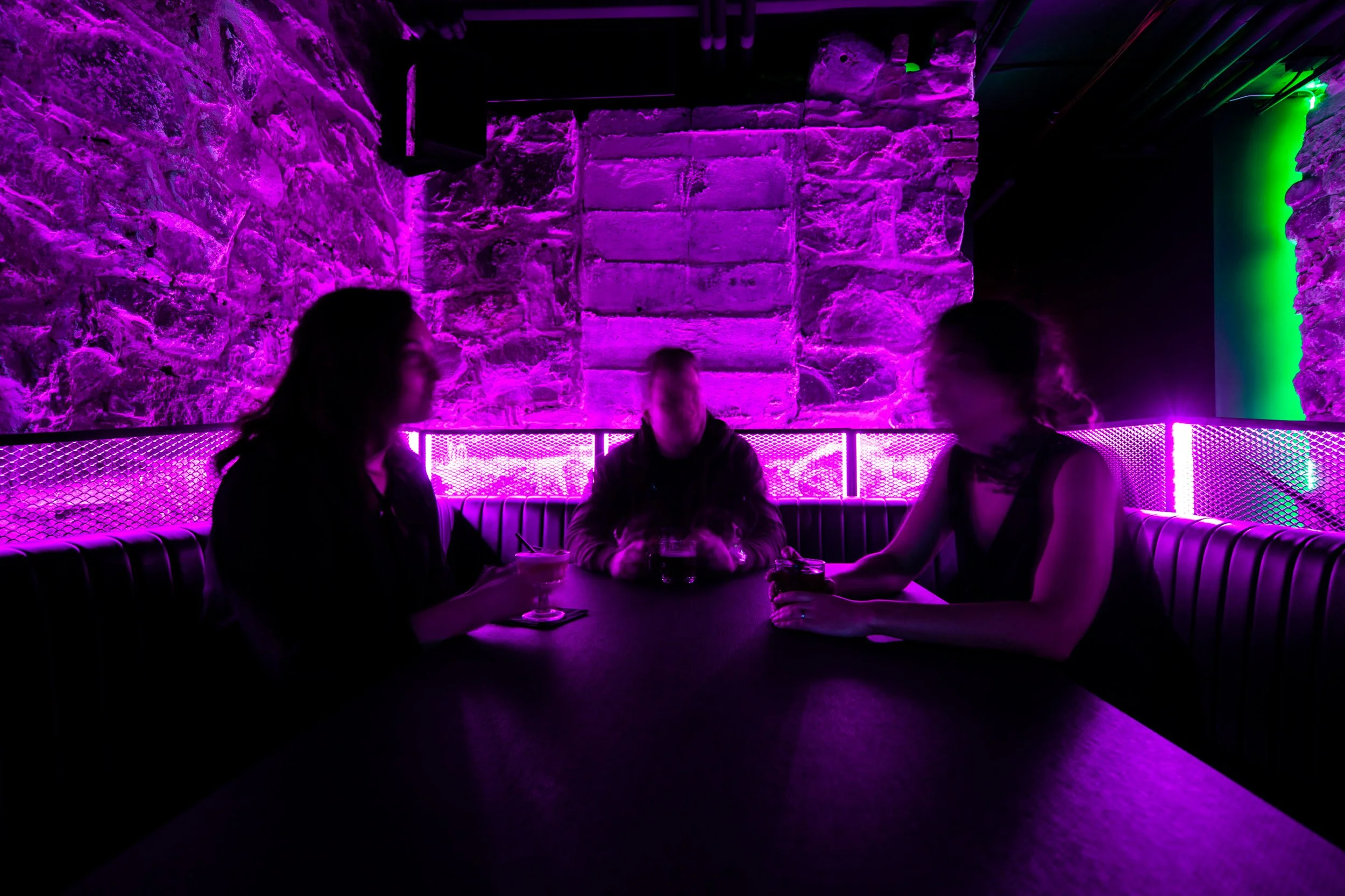
LED lighting was field tested for impact and intensity and provided a space fully illuminated by energy efficient low voltage lighting. A blue backed high-top bench sits across from the pink toned bar stools that may stack away for ‘standing room only’ concerts and events. At the back of the space a pair of purple metal mesh booths with black vinyl seating with vertical stitching reflects back to old bench seating in vintage cars.
A light shelf serves double purpose as a drink rail while highlighting the custom mural by French street-artist Nelio, an artist commissioned as a collaboration between the architect and owner. A similar mural at the top of the stairs hints what is to come as guests enter under a custom retro-style neon logo.
The architects designed the first floor of the building into Nightcap the previous year with gender neutral bathrooms and common area sinks, a first in the area through appeals with the building review board to meet equitable objectives not currently supported by the plumbing code requirement for separate gendered facilities. This smaller space only required 2 bathrooms, both gender neutral and ADA accessible. Given feedback from the LGBTQ+ community about the desire to use fixtures aligned with their gender identity with a greater level of privacy, one of the bathrooms contains a urinal, typically found in continuous banks with minor partitions lacking adequate privacy.
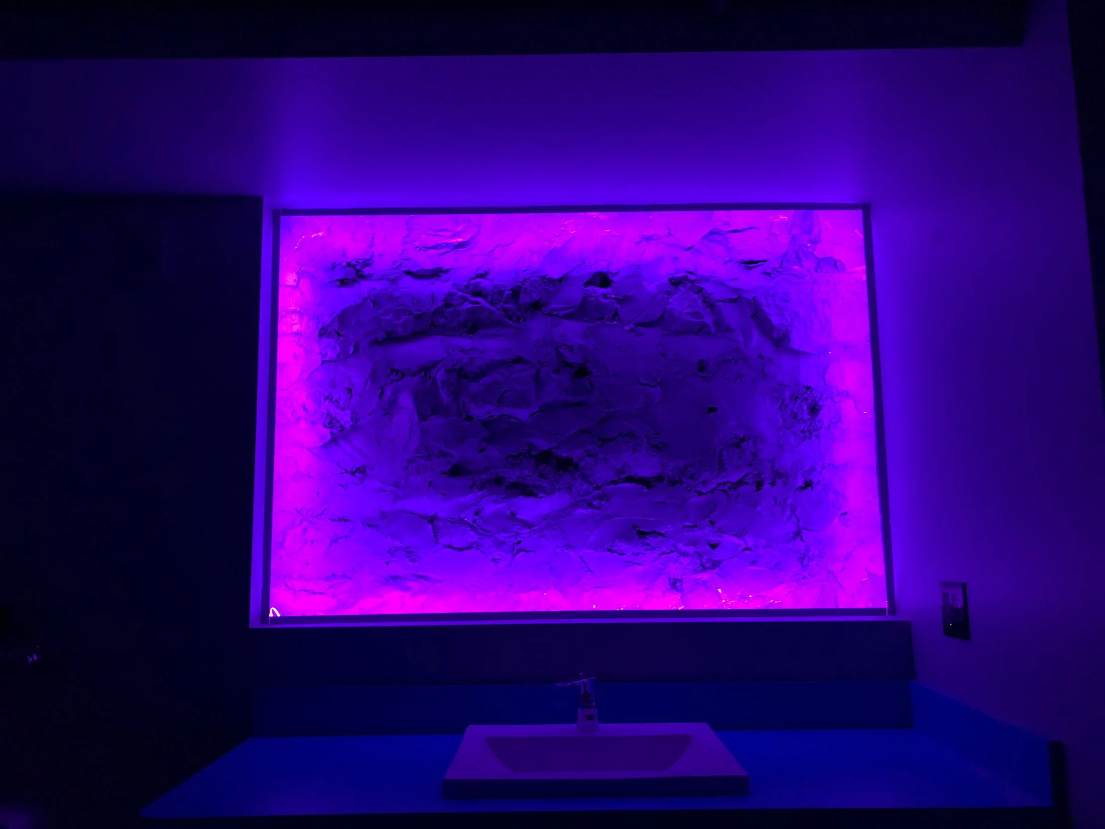
Details of the bathrooms include a framed opening in the wall presenting a view not of yourself in the mirror but of the exposed original fieldstone rock foundation. A low light purple toned frame gives a depth deceiving view of the wall. A full length mirror opposite the light abyss enables guests to check-out your look with a textured and lit background
Recognitions:
2018 LIT Lighting Design Awards : Ambient Lighting Category Winner
2019 World Architecture and Design Awards Second Award
2019 IES Illumination Award of Merit: Interior Lighting Design
MLive: Lo-Fi bar to bring live music, neon dragon to downtown Ann Arbor
ClickOnDetroit: Meet Lo-Fi: Live music bar set to open on Ann Arbor's Main Street


